


Contour Diabetes App: Intro Tour
When I was introduced to the project, there was an existing Intro Tour designed to help the user with navigation and features. However, it was very cumbersome and user testing showed a clear lack of retention along with frustration even navigating through the tour.


Before:
Before:
-
The original Intro Tour had 40 total screens, which is overwhelming
-
So many things were being presented to the users that there was no chance for comprehension or retention
-
Most of the screens were partially interactive/partially not, so navigation was inconsistent and confusing.
-
The original Intro Tour had 40 total screens, which is overwhelming
-
So many things were being presented to the users that there was no chance for comprehension or retention
-
Most of the screens were partially interactive/partially not, so navigation was inconsistent and confusing.


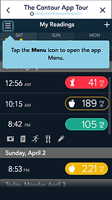
After:
-
The intro tour was moved to appear once a user enters the app for the first time
-
It highlights the most important features on the home page with short explanations
-
The overlays are in-context and simple, which helps users have better retention

Explore more Contour projects


