


Bento Box Survey
A survey designed to learn customers' preferences for a curated clothing box while also introducing them to the experience and brand.

The Project
The company & service
M.M.LaFleur, a DTC women's professional clothing company, used a service called Bento as their primary acquisition tool. Customers received a curated box of clothing that allowed them to become familiar with the brand and try before buying.
The role & team
I was the sole designer for this project. I worked closely with a Product Manager and Engineering team and consulted with many stakeholders including Creative, Marketing, Merchandising, and Customer Experience.
The results
The new design doubled completion rate, improved mobile usability, created a framework for easy updates, and educated customers about the experience and brand.
How Does Bento Work?

Take a quick survey about your work dress code, style preferences, and wardrobe needs.

Receive a box of looks hand-selected by a stylist.

Keep what you like, send back the rest. Order a box as often as you'd like - there's no commitment!

Project Considerations
-
Design the survey using reusable layouts and create a mobile-friendly experience to support 80% of users taking it on a mobile device
-
Reformat the survey questions to help drive a delightful experience while also setting customers' expectations about what to expect
-
Show customers that we are really listening and taking their survey into account and make returning customers feel like we know them
-
Provide ways to customize the experience for different customer segments and marketing initiatives
-
Define the core dataset: What information do stakeholders - stylists, marketing, and analytics - need from customers?
Competitive Research
I analyzed and mapped out the questions asked and survey flows for similar stylist-curated clothing boxes from other companies such as Trunk Club and Stitch Fix.


Existing Content Feedback
I then user tested the current survey to identify possible areas for improvement in the question content and survey interface.
“I really was wondering at the end: How many pieces come in each box? Will I be able to continuously give feedback to the stylist? Is return shipping built into the service, or do I cover that?”
“I would’ve lost interest after the section about choosing the outfit that I like best, I feel that there should’ve been more choices to choose from and more questions to answer regarding my personal style.”
"The models felt stiff and I didn't get a good feeling for what type of clothing this company has... the images were much too simplistic without style or character.”
Existing Interface Feedback


Individual cards do not indicate there's any more content below causing users not to scroll.
The introduction is wordy and doesn't answer users' questions about the process.
Having users create an account after two questions is a roadblock to continuing the survey.
Account creation should happen once the user has completed the questions and is invested.
There aren't enough questions to gauge a customer's style.
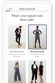
More styling questions and better representations of the clothing should be added.
The icons in this question are not related to the body and are difficult to interpret.
It's important for the user to understand their body type since it's important to stylists.
Iterate, User Test, Repeat
I designed and redesigned the survey to create a user-friendly flow.

Modular Design
I created a template that allows for faster development and future changes to the survey questions.


User Feedback on New Survey
I developed a fully-functioning prototype in order to A/B test the original survey versus the new design. The testing confirmed initial findings and identified any areas of confusion before development.
"I felt much more comfortable with the new design because of what was being asked. The first time around there just wasn't enough questions and my thought was ‘what the heck is going to be in the box.'"
"It's clear that they may need time to learn your style and preferences, and that will be based on what you send back and what you keep. It's telling me right up front, it makes sense, and I know what to expect."
“It left me with very few questions and this time I actually became excited as I walked through the questionnaire. The flow was easy and a bit fun to complete, every page was incredibly simple to fill out.”

Redesign Performance
Before sending all traffic to the new survey, we A/B tested the original survey against the new design with actual customers to get more quantitative data. The conversion rates increased +50% on mobile and +110% on desktop.
Survey Completion Rate by Device
Original
New
Desktop
Tablet
Mobile
2.19%
1.69%
1.08%
4.68%
2.25%
1.62%


